
Posted by Mies Hora
I’m a firm believer in the development of new and more powerful ways to visually communicate important messages non-verbally. As a wayfinding professional and symbol designer with a keen interest in all things non-verbal, I say “by all means, let’s move communicating the accessibility concept forward”. But caution is appropriate when attempting to replace a well-established and vitally important societal icon with something that has not been fully usability tested, approved by relevant public regulators, or that has survived the rigors of a comprehensive design process.
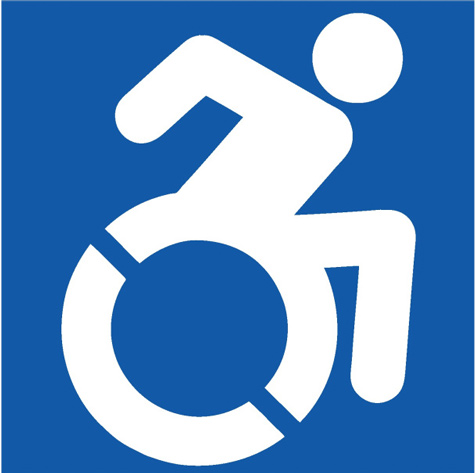
On July 25, 2014, New York Governor Andrew M. Cuomo signed legislation (A.8193/S.6846) that amended existing law to require the removal of the word “handicapped” from new or replaced state signage, as well as update and destigmatize the accessibility logo. The state will change the terminology on such signs, employing the word “accessible” instead of “handicapped.” The new revamped logo design, known as the “Accessible Icon,” depicts an ‘in-motion’ visual of a person using a wheelchair (above). Nice, right? Hmmmm….
Developed in 2012 by Sara Hendren, Brian Glenney and Tim Ferguson-Saunder, the new icon started out as a grassroots effort in Boston with supporters placing stickers featuring the updated graphic over signs with the old wheelchair symbol. To date it has been adopted by a number of organizations and municipalities in the U.S., including the NFL’s Jacksonville Jaguars, the city of Merriam, Kansas, and New York City, among other localities, businesses and schools. Abroad, disability organizations such as the Enabling Unit in India are promoting this version.
One of my transportation clients worriedly asked me to look into this new symbol further, because altering or changing a ubiqitous accessibility symbol sign in use is not an insignificant prospect for any large public institution. As part of the process of researching the new accessibility symbol, I therefore set out to study it’s viability by looking at the response to it by wayfinding design and standards professionals, governmental agencies, and ADA specialists, as well as the disability community itself.
I was immediately struck by the realization that few, if any, comments were in evidence by any reputable or established wayfinding or symbol design specialists in favor of, or against the new design on all of the web sites, news articles, or announcements researched, including those of NY State.

L to R: Original ISA (International Symbol of Access (1968), ADA-compliant (Whitehouse/Meeker, early 80’s), ‘In-motion’ version (Brendan Murphy, 1986), ‘In-motion’ variant (with foot), AIP (2012)
As a wayfinding professional, my initial impression of the newly proposed AIP was decidedly mixed. While there is universal agreement among those in my field that there’s room for improvement in the original International Symbol of Access (ISA) symbol dating from 1968, there are also good alternatives available and in use already. Upon further reflection, it appears that the extreme approach taken by the AIP has erred in a number of important respects (see detailed brief HERE).
After discussing the issue with a broad array of wayfinding and design colleagues, and researching the topic extensively, I came to the conclusion that the new AIP symbol is the result of misguided enthusiasm and over-reach. Simply put, the AIP is not a well-balanced and consistent member of the international symbol ‘family’. However, that’s not to say that a more nuanced solution couldn’t be developed that meets the desired criteria of a more ‘active’ disabled constituency.
While the noble effort to modify the symbol for access to the new ‘in-motion symbol’ can be understood from the viewpoint of wanting to “de-stigmatize the access logo and to correct society’s understanding of accessibility” – as stated recently by Governor Cuomo – this particular path toward those goals may prove, in my considered opinion, to be a decisive stumble. The advocates of the new ‘Accessible Icon’ design may have inadvertently chosen a visually flawed vehicle to make their point, and risk alienating and confusing the very audience whose lives it was ostensibly designed to enhance, not to mention the general public.
You can view the complete illustrated brief (HERE). Please read it and decide for yourself whether the AIP is a ‘step forward’ or an accelerated detour. Your comments and thoughts are welcome.


Hot sexy porn projects, daily updates
http://nanaimopornstar.topanasex.com/?rachel
homemade porn video for soldier zeba hardcore porn tube female squirt porn movies free gorilla graz porn handicapped porn star
Enjoy daily galleries
http://manaporn.amywilliamsporn.moesexy.com/?whitney
free online porn videos dildo anal small porn boobs biggest dick hardcore porn blinded slave porn man sucking dick xxx porn
Free Porn Pictures and Best HD Sex Photos
http://freepornslight.xblognetwork.com/?tatyana
free young porn pix free movies of pussy pounding porn xxxx porn clips asian homes made porn video pokemon porn ash fucking his mom
Hot sexy porn projects, daily updates
http://hmoobpornstar.alexysexy.com/?ericka
cartoon shemaleporn argentina amateurs 3 paula porn jamaica porn video free disabled porn video sexy blonde mom porn star
Hot galleries, daily updated collections
http://hairylesbians.fetlifeblog.com/?taylor
free porn videos ffm interracial teens molested by old guy porn actress videos porn free porn povies ben 10 porn videos online
Best Nude Playmates & Centerfolds, Beautiful galleries daily updates
http://lesbian.porno.fetlifeblog.com/?aubree
girlfriends videos porn black porn stars female swedish quicktime porn mini teen porn busty belle porn star
My new hot project|enjoy new website
http://datingsitesfree.fetlifeblog.com/?susan
hardcore bbw porn tube ico porn has porn actress christine young retired asian school porn famous italian porn stars
Sexy teen photo galleries
http://littleboyporn.energysexy.com/?juliet
young naked girl porn porn starts amber dark free acrtoon sketches porn rupaul porn porn lisben
College Girls Porn Pics
http://redheaddesign.instasexyblog.com/?paloma
wild hardcore porn videos dragon ball z porn games porn party tube hardcore xhamster amputee extreme porn beta user porn
Dirty Porn Photos, daily updated galleries
http://pornclipsvote.hotblognetwork.com/?corinne
sanitary pads porn steve tuck gay porn jett black uk porn hardcore porn girls young live s gay porn
Hot new pictures each day
http://lrgwomen.catshopusa.bloglag.com/?akira
youngest porn tube videos chav mobile phone amateur porn mobile phone free porn downloads feet porn free downloads dwonload torrent interracial cum swappers porn
Best Nude Playmates & Centerfolds, Beautiful galleries daily updates
http://redporntoons.ipodpornsites.instakink.com/?summer
ehart eheart porn steaming asian porn tenticle streaming porn free dogg sex porn pics mature ass porn pics
Big Ass Photos – Free Huge Butt Porn, Big Booty Pics
http://vidosesexy.relayblog.com/?ana
emily deschanel porn naked free kira kener porn clips havana ginger porn star sisters parent directory cd1 porn brittany bruke porn star
Daily updated super sexy photo galleries
http://freepornleather.xblognetwork.com/?rebeca
free porn sample vid ipinkvisual porn testicle squeeze porn porn my wife would like star from ghetto teens porn movie
Nude Sex Pics, Sexy Naked Women, Hot Girls Porn
http://nsfwgirlfriend.relayblog.com/?alessandra
oldest moms porn windows media porn kidnapped tied crying fucking porn fdree porn africa queen porn
I guess I am the wheelchair user this icon is based on. Myself and a lot of my friends are mono-skiers (sit skiers) and hand bikers. The current politically correct term for us is disabled, which literally translates to unable, so obviously we have an image problem.
While the chart of disabled icons shows a progression, it ignores the fact that the vast majority of the signs sill use the symbol on the far left. So should we worry that the one on the far right isn’t the perfect symbol, or maybe we should just decide on one that isn’t so offensive? Yes the current and original logo is offensive, it has been for decades, which is illustrated by all the other attempts to make it less offensive over the years.
There never will be a perfect symbol for disability as individual disabilities are so diverse. Wheelchair users already make up a small portion of all disabled people, yet no one individual disability could be an acceptable icon for all disabilities. Yet icon progression requires progression, as opposed to being completely different, just like the Coka-Cola logo has changed over the years, different, but still identifiable. While the left logo is still the most ubiquitous, people have some exposure to the center icons, and the new icon is just a progression.
Keeping the specific blue background, yet illustrating the highest functioning wheelchair user is about as good as we can do to still convey the message without being demeaning. Just like the Jim Crow era, we have a good marketing campaign, as the symbol is used extensively in all public areas. You’ll see the blue painted asphalt and a sign out front nearly every business in this country, and on doors and signs throughout those businesses. It will be obvious, not confusing or alienating. Most people see it as progression, just like the Coke logos over the years, and the few that don’t get it, will ask.
While the wheel suggests inability, the person shows ability. Is that so bad? Our other sign choice is inaction, which just perpetuates the use of the original offensive logo, which has been the status quo for nearly fifty years.
As long as we’re going to the effort of changing signs, we should also eliminate the word “disabled”. Crippled, handicapped, disabled are all degrading outdated terms. “Diffabled” is far superior. It is a portmanteau (similar to a contraction), of the words “Different” and “Able.” While not in common use, and most commonly refers to high functioning people who overcome their disabilities, diffabled is a better description for all of the disabled, a progression, yet unoffensive. However If we refer to just the high functioning disabled as diffabled, it’s just further alienating those with more severe disabilities. It would be like differentiating black people with different terms depending on the darkness of their skin.
While most may think of Steven Hawking as severely disabled, shouldn’t we all instead think of him as enormously gifted? It’s apparent we need a change, why not use the least offensive term and icon that we can? Some will say this is just political correctness run amok. If I just skied a great line and a close friend of mine told me,”that aint bad for a cripple,” I would laugh my ass off. I understand context and a good joke, however institutional degradation isn’t a joke. Businesses spend tens of thousands of dollars to comply with ADA guidelines, is it really overreach to ask they spend the few extra dollars to replace the offensive signs those accommodations are intended to help?
Is it so horrible the new term and icon highlight ability rather than inability, while still conveying the message?
Hi Mies, Nice job of a well balanced and fair minded review and evaluation – I look forward to seeing and reading future posts.
You are right… it’s a comical, inappropriate symbol.
The concept isn’t bad, but it is just way too energetic, almost in a caricature-like way. If you look at it alongside Don Meecker’s icon set you will see that he has many icons that express movement and energy, but are not over-the-top like this one, which is almost comical. It differs too much from the character of the established DOT set even if it uses a similar graphic language. I think the stenciling break is new since I saw earlier versions, but because of its diagonal nature at first glance almost makes this a “NO WHEELCHAIRS” icon.