
 This post is based on an excerpt from the recently published wayfinding reference Official Signs & Icons 3 by Mies Hora.
Cyclists Deserve Better
A consensus formed more than a decade ago that signing standards for cycling in the public right-of-way needed to be more comprehensive, more consistent and clearly readable as a system of signs, not just individual postings. As cycling has become an actively shared part of the surface transportation network, the existing set of signs are incomplete and do not create a cohesive lineal statement that is differentiated from signing for motorists.
This comprehensive new bicycle signage system for the United States has steadily developed, undergoing extensive human-factors and other testing, with very positive results: up to 15% fewer bicycle-related accidents being only one of the many advantages to the new signs. So why hasn’t this trailblazing new system been officially implemented yet? Read on.
Creating Sign Standards for Cycling Facilities
At a 2008 meeting, the newly formed “Working Group for Signing Bicycle Facilities” realized that this initiative was too late to make an impact on the 2009 revision to the FHWA MUTCD (Manual on Uniform Traffic Control Devices), which unfortunately is done only every ten years. Given the growing importance of cycling on roads, trails, and in cities, an urgency was felt to pursue independently a way to upgrade the standards for bicycling signage.
A proposal emerged to comprehensively upgrade the national standards for bicycle facility signing by creating a clear hierarchy of information for all types of bicycle signage: identification, guidance, warning and regulatory postings. The enhancements were designed to improve glance comprehension, provide consistency for all applications, create simplicity in layouts and symbols, enhance legibility, and where possible, develop a system that can help reduce sign clutter on urban streets, rural roads and trails, and promote a positive awareness of alternative transportation.
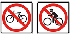
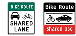
Examples of the new signage in this post are from system recommendations that include both signs in the current MUTCD standard (below left) and signs adapted by the various cities studied in the development process (below right) from the Proposed System Overview.* Because the reading of regulatory legends is dependent on pure legibility, all proposed signs are displayed in mixed case (initial capital letter) Clearview 3-W and Clearview 3-B.
Significant Impact: Cities, Roads & Trails
The scale of the application of improved signage will be great: there are 250 cities over 100,000 population; over 18,750 cities, towns and villages with less than 100,000 population; and 19,000 miles of bike-paths and rail trails, nationwide. Working Group members received many comments, especially from city traffic engineers, that existing sign standards are not addressing a growing need to make routes safer. State, regional and U.S. bike routes will link to urban and suburban routes making the need for a systematic approach used consistently in all jurisdictions of growing importance.
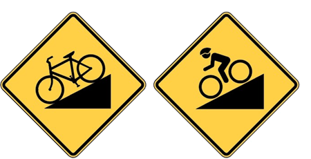
Animate Symbol: Priority
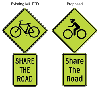
The Working Group focused initially on the bicycle symbol as a priority for revision. The use of the inanimate bicycle symbol in lieu of an animate bike with rider was identified as a critical issue. Bicycling is an active program and logically should be identified by an active symbol. Integral to this process of signage revision are a series of human factors research projects to inform the design process and validate recommendations.
 The initial piece of research was legibility and comprehension research for the bicycle symbol. It compared the existing inanimate bike symbol to three versions of an animate symbol with bike and rider. The results of that study showed significant improvement in both legibility (viewed beyond threshold) and understanding (viewed inside viewing threshold) of the animate designs. Most important to this exercise was that safety critical applications, including warning signs, were three to four times better understood with an animate symbol and designs that eliminate unnecessary detail but, are consistently easier to read with this reduced spatial noise.
Although these designs deviate from highway sign design convention, they have been designed to be substantially compliant with current standards while incorporating a more up-to-date approach to design. The Federal Highway Administration (FHWA) requires that any changes to the MUTCD be validated by independent human factors research projects. For this system design this includes: the addition of the animate symbol, use of mixed case Clearview font legends on all applications including regulatory and warning signs. Creation of common formats and graphic devices to provide a lineal statement that accommodates glance reading, and the possible inclusion of the color blue in lieu of highway standard green and black. At this writing, this research is more than half completed.
Red Tape Strikes Again
One of the authors and progenitors of the Proposed System Overview,* Donald T. Meeker, a Fellow of the SEGD (Society for Experiential Graphic Design), recently explained, “Unfortunately in late January 2016, the FHWA rescinded their 12-year-old approval of use for the Clearview typeface (based on altered data and ignoring key studies from Univ. Michigan, Penn State and MIT—and the funding state for the proposed, essential research pulled out. Meanwhile, there is bill in the House (bi-partisan) supporting the rescinding of the rescission, all state chief highway safety engineers (AASHTO-SCOTE) voted to reinstate as did the full board of directors of AASHTO. All have been ignored by FHWA. That all took place when Obama was in office. It is difficult to envision anything changing during the new administration—very inauspicious given what this can do to help provide order to the urban streetscape.”
The assumption was that once the last three to four studies were complete (two critical ones are done) an independent forum would be available to confirm the proposal with cities and states, and then have the horsepower to advance the standard onto the FHWA. Bikers, pedestrians and motor vehicles nationwide will all be the better for it. Hopefully, it will not remain an uphill battle from here.
For further information on the new signing bicycle facilities, please contact Donald at Meeker & Associates, Inc., meekerdesigns.com
*March 2011 presentation to the Federal Highway Administration Office of Safety Design by members of the
Working Group for Signing Bicycle Facilities including:
Alliance for Biking and Walking
Adventure Cycling Association
Alta Design + Planning
American Trails
Association of Pedestrian and Bicycle Professionals
Bikes Belong Foundation
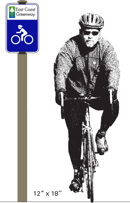
East Coast Greenway Alliance
League of American Bicyclists
Meeker & Associates, Inc.
Northeastern University Dept. of Civil and Environmental Engineering
Rails-to-Trails Conservancy
Society for Environmental Graphic Design
Toole Design Group
Penn State Univ.: The Larson Transportation Institute
Portland Bureau of Transportation
U.S. Army Corps of Engineers
Virginia Tech: Grado Dept. of Industrial and Systems Engineering