
The following essay is an excerpt from Paul Mijksenaar’s Foreword for the wayfinding reference work, Official Signs & Icons 3, developed by Mies Hora and published in late 2017 by Ultimate Symbol.
Visual Lingua Franca:
Characteristics, Limitations & Opportunities
by Paul Mijksenaar
 Around 1895, Touring Club Italiano, an Italian cyclist’s association, introduced the very first road signs. Other countries soon followed. Rather than to overcome language barriers, road signs were introduced to provide drivers of vehicles that were able to move significantly faster than carriages with instant information and timely warnings.
Viennese economist and sociologist Otto Neurath (1882-1945) designed a visual language called ‘Isotypes’ in 1934. Consisting of pictograms, it was intended to transfer knowledge without language barriers. Neurath used it to spread economic knowledge among a large, often uneducated audience. He felt that he would best succeed by enlisting the help of the best illustrators, German artist Gerd Arntz (1900-1988) being the most famous. Neurath’s work, which is kept in the archives of the University of Reading and the Haags Gemeentemuseum (the Netherlands), reveals the huge influence Gerd Arntz had and still has on contemporary designers of symbols.
After the success of the road signs, the opportunities offered by language-free communication were also recognized by the International Olympic Committee (IOC). Since 1948, it has commissioned the design of many sets of beautiful sports symbols for each of its four-yearly Games.
Next, the Union Internationale de Chemins de fer (UIC) appreciated that passengers travelling by train could really benefit from uniform symbols. Then came a breakthrough initiated by the manufacturers of, among other things, electronics (Philips), white goods (Siemens) and automobiles (Toyota). Companies were especially enamoured by the economic advantages. Using only symbols on their products meant they could sell them anywhere in the world, bypassing the need to store up large quantities of goods per linguistic region. However, the users lost out. They were con- fronted with hefty multilingual manuals in which they had to look up the meanings of many visual puzzles (and try to remember them).
But the compactness of symbols turned out to be of great value to product designers. Symbols easily fit on small controls in cars, on mobile phones and on computer screens. Once you know the meaning of the symbols on the dashboard of your own car, you can effortlessly drive off in a Japanese rental.
 A Warning: Symbols Must Be Learned
As this new edition of Mies Hora’s reference demonstrates, the enthusiasm for symbols is high, especially among designers. The possible uses of symbols appear unlimited. A warning, however, is in order.
By definition, symbols aren’t self-explanatory but have to be learned. This isn’t a problem for motorists, because they have to study them to pass their driving test. But things are different for users of airports, train stations and hospitals. This group of users can hardly be expected to take a test on symbolism first.
That’s why the people that create symbols – and in many cases these aren’t designers – look for symbols that represent the function they designate in an associative or concrete manner. This works in many cases, but unfortunately it often fails in even more. People that don’t know what a diseased kidney looks like won’t recognize the pictogram for the Renal Unit that some hospitals use. People that have never seen a deer before won’t understand the road sign with a picture of a jumping deer on it that presents a warning for crossing wildlife. A boar, a fox or a bear may also pop up in front of your car. Here, the association with a safari park is more obvious.
Standardization
For symbols that have to be used both in different applications and internationally, it is important (for their recognizability) that they look the same everywhere. The International Standardization Organisation (ISO) provides clear protocols and guidelines for this (for more, see page 202). Most importantly, symbols must be strictly tested for understandability and recognizability. Their design is free to some extent. Standard- ization only involves a description of the image content. Designers can fill in the details as they please.
There are some restrictions with regard to legibility, especially when symbols are used in a very small size. This freedom has been created to meet the requirements of, for instance, corporate styles.
 The makers themselves have to be on guard against possible obsolescence and adjust when necessary. An automobile and a locomotive from the 1930s look significantly different than a contemporary car and train, which can cause young people to misinterpret.
The appearance of the mobile phone, for instance, changed very fast indeed. First, it had a display with a lid for the keyboard and an antenna. Next, it had a display with a keyboard directly below. Finally, the antenna disappeared as well and now there is only the one display for both image and text.
It’s unclear what the proper response to all this should be: it’s probably best to wait for some kind of stabilization, rather than try to be trendsetting. Sometimes symbols get stuck, the image frozen in time, like that of the old-fashioned telephone receiver that still indicates a public telephone (which will disappear from the city streets soon, along with its obsolete pictogram) and the symbol for a ladies’ toilet (I fear the latter will forever preserve the cliché that women have to wear either dresses or skirts).
Developing an International Visual Language
Symbols work best if they have a visual relationship with concrete and tangible objects in our environment. But they still have to be learned.
For symbols to develop into an international visual language they must be learned, either by means of instruction or simply by trial and error, something that children are especially good at. In wayfinding, therefore, meaning is often also expressed in text, in support of symbols. It may seem excessive, but it’s very useful for people seeing those symbols for the very first time.
 A second aspect that symbol designers have to take into account is the increasing use of electronic devices. More and more, these are capable of rendering instructions in the mother tongue of the individual user. This means that symbols designed to overcome language barriers are no longer necessary: people can just choose their own language. And as long as spoken and written language are superior in human communication, the role of symbols is reduced to match their aptitude for compactness. Their sole remaining advantage is that they can be read from a great distance (road signs, wayfinding) and that they fit onto very small surfaces (keys, displays)!
But there is hope, too! Apart from closed series of symbols (road sign and safety symbols) there are millions of symbols that almost everybody recognizes and understands thanks to the Internet. Symbols for card games, for weather reports, cartoon characters, emoticons: too many to mention.
Detached from their origins, they are used to render all kinds of notions very quickly: a hare and a tortoise for fast and slow, a heart for love, a red cross for emergency services, a cloud for online storage, and keyboard punctuation marks to make a joke or express disappointment. For designers that are aware of limitations on the one hand and opportunities on the other, there is an unlimited future in new symbols. Mies Hora shows us how far we have come.
Paul Mijksenaar founded Mijksenaar in 1986. The company started its 30 years of airport wayfinding exper tise in 1990 with the commission of a total review of the signage system at Amsterdam Airport Schiphol. As professor at Delft University of Technology, Paul introduced the application of human factors and psychology in the specific field of information design. He is the author of numerous scientific publications and books including ‘Visual Function, an introduction to information design’ and ‘Open Here, the art of Instructional Design.’ Paul is a member of the SEGD, Alliance Graphique Internationale (AGI), and Sign Design Society.
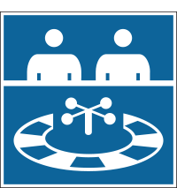
Note: Paul’s work for Schiphol Airport, Port Authority and others is represented in Official Signs & Icons 3, Chapter 5, beginning on Page 107. The three sample pictograms above are from the Schiphol system.