
Lance Wyman: Process. A proposal for the 1976 USA Bicentennial identity
by Unit Editions
This post is adapted by Mies Hora from a Logo Creative book review.
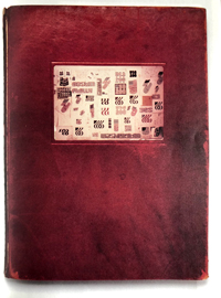
This book is a near reproduction of the one-off, leather-bound ‘sketchbook’ that Lance Wyman made to document his design process for the creation of a logo and identity design for the 1976 American Bicentennial celebrations to mark the creation of the USA as an independent republic. It’s a record of the creative process that Wyman went through to arrive at a refined and workable solution. The book was published by Unit Editions who is an independent publishing company producing books for an international audience of designers and followers of visual culture. The company was formed back in 2009 by Tony Brook, Patricia Finegan (both Spin) and Adrian Shaughnessy.
It’s rare for designers to reveal so much of their inner workings and behind the scene process and sketches, and even rarer for it to be documented with this degree of thoroughness. But Lance Wyman is no ordinary designer. The work was done in Mexico in 1970, and as all Wyman’s admirers know, he’d gone there to design the graphics for the Mexico 68 Olympics. But in 1971 he returned to the USA, and to a design scene that was markedly different from the one he had left. For a start, he had acquired a stellar reputation.
His work for Mexico 68 was widely acclaimed – even the art critic of the New York Times had written a fulsome appreciation. Wyman also returned to a country that was on the verge of officially decreeing that design was to have a central role in Federal policy. One year after Wyman’s return to New York, Richard M Nixon, the 37th president of the USA, initiated the Federal Design Improvement Program, a far-ranging initiative aimed at producing better design for government-funded projects. Wyman was to work on numerous projects that came from this initiative, some of them amongst the most celebrated of his career: National Zoo (1975), Washington Mall (1975), Minnesota Zoo (1979).
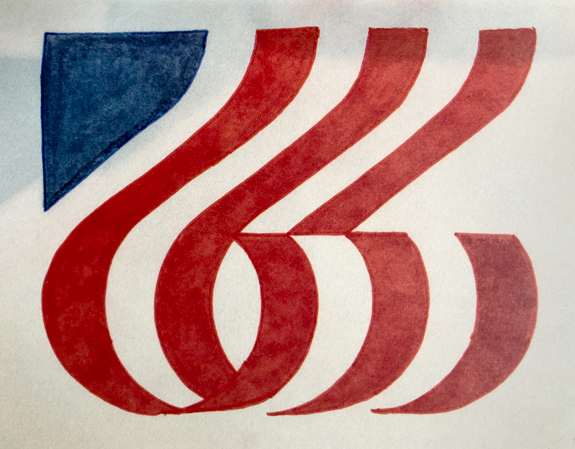
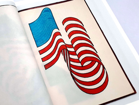
But before working on any of these large-scale civic projects, he took part in a competition to design the graphics for the Bicentennial celebrations. As can be seen in the pages of this book, Wyman approached the task with his customary mix of graphic rigor and visual ingenuity.
The book starts with an opening interview with Adrian Shaunghnessy, Wyman explains the genesis of the project, the reasons why it was never implemented and discusses the importance of process in any designer’s work. Lance reveals that although he won the competition, he didn’t end up doing the work on the actual logo because he didn’t have a US office with staff at the time (he was then working in Mexico), and he declined to work under the auspices of a previous employer, the George Nelson office. Eventually, the bicentennial committee engaged Chermayeff & Geismar Associates, where Bruce N. Blackburn (co-designer of the modernized NASA insignia) designed the final logo. It consisted of a white five-point star inside a stylized star of red, white and blue.
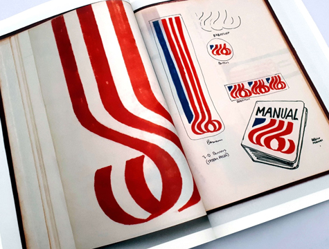
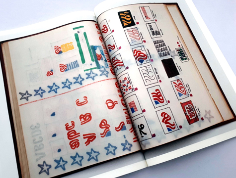
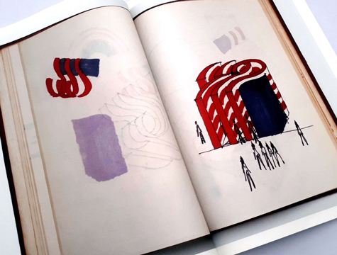
The book shows you Wyman’s thought process as he progresses. As the progression continues throughout the book, it shows the ideation stage of the mark and how Wyman envisions the mark on maps and flags, book covers and badges and play tents for children. His process goes even deeper with mock-up sketches of the identity mark being used on the side of carriages, trains, boats, plains and even a structure that people can walk between. What’s great about this book is that it shows a visual design thinking process from a single idea through to the progression of a working design solution with each stage been documented along the way.
Lance Wyman is a legend within the logo and brand identity design industry and looking through this book gives you a special feeling that this is ‘top secret,’ behind the scenes, and something we should not be seeing. It’s great that this book has been released, as it gives you an insight into a designer’s thought process in a visual way, and what’s even more special is that it was done back in the early 1970s, when technology was nowhere near as advanced as we know today and producing graphics, manipulating type and other graphical elements was developed manually. As a bonus, at the end of the book as mentioned earlier, there are seven pages that include the typewritten document that accompanied Wyman’s slide presentation of the design and graphic program.
This book is highly recommended for designers just starting out to learn more about the visual thought process and design thinking that goes into creating an identity. It is also very handy for the more seasoned and practicing designers to see how the legends did it back in the day.

Lance stated, “The hardest thing to teach is having a concept, a new idea that can become a good solution. With the computer, there is a tendency to start with the final refined solution. But this misses out on an important step – first establishing a unique concept. There is a role for this book to show process, to show how a concept is the first step, and how it is refined over time. It’s a process, not instant.”
Lance Wyman: Process. A proposal for the 1976 USA Bicentennial identity may be acquired here.