
Challenge: Develop nomenclature, symbol content description, and a wayfinding icon/symbol sign that directs ride service customers and driver/operators in public spaces to the proper pickup location(s). This post presents an overview of the process the working group followed to arrive at a recommended standard for airport adoption, with a focus on the nomenclature and icon design from a communication design perspective.
Term & Icon Development Process
Research, Nomenclature, Content Description, Visualization / Development, Field Testing / Human Factors, Design / Peer Review, Final Design, Standards Manual, Implementation
Overview
Passengers are increasingly opting for use of Transportation Network Companies (TNC), such as market leaders Uber and Lyft, over traditional transportation options to travel to and from airports around the world, but wayfinding signage was not standardized, causing confusion among passengers and TNC drivers while increasing curbside congestion. In December 2017, the American Association of Airport Executives (AAAE) held a Solution Summit through its Airport Innovation Accelerator on the topic of TNCs. The Summit was attended by airport innovation leaders from across the country, and one of the central takeaways the participating airports identified was the lack of standardized term and icon to properly guide passengers to TNC pick-up points. Airports asked AAAE to organize a working group to analyze the problem, suggest a common term and icon, and rally airports to a set standard.
Mies Hora, President of UltimateSymbol.com, was engaged to create the recommended term and icon. Known by SEGD as “the symbol guru,” Mies has decades of experience in the field of non-verbal communication, symbol design, and wayfinding signage. He is the author, designer and publisher of the standard reference used by wayfinding professionals the world over: Official Signs & Icons 3. He assessed and designed the symbol sign system for one of the largest transport networks in the world, New York’s MTA (Metropolitan Transportation Authority), and has led or consulted on many other detailed symbol projects.
The working group was comprised of AAAE, TNC’s (Uber and Lyft), thirteen of the nation’s top airports including the Port Authority of NY/NJ (JFK, EWR, LGA), LAX, Miami, Dallas Fort Worth, San Fransisco, Portland, Seattle, Denver, Jacksonville, et al., Ultimate Symbol, and LeighFisher, a consulting company providing management advisory services to clients in aviation and other infrastructure industries.
Project Scope & Objectives
The working group’s objective was to develop a passenger-facing common term and universal icon that directs TNC customers and driver/operators in airports to the proper pickup location(s). The challenge was to create nomenclature and an icon that would have longevity. To do that, Mies suggested that the working group clarify what was intended to communicate, first in words, before attempting anything visually. The process would be to first analyze existing airport signage, determine the best path forward for the term and icon design, test the selections with airport planning experts and passengers, as well as the design community, then present findings to airports in the working group to arrive at an airport-approved common term and icon.
Nomenclature
A study done by the Airport Cooperative Research Program (ACRP) in September 2017 found the most commonly used terms were “Ride share/ride sharing,” “TNC,” or simply “Uber/Lyft.” After close examination, the team determined that none of these terms exactly described the concept to the degree appropriate for wider adoption. The term “Ride share” or “sharing,” while currently most widely adopted at airports, is a decades-old legacy term that does not accurately convey the relatively new application-based TNC category, which is a paid transaction. It also creates confusion with the commonly used airport term “shared rides,” which is used for hotel shuttles, shared-ride vans, etc. During the development process, the working group considered other terms such as “App-Based Rides/Pickup” and “On-Demand Rides/Pickup.” While concerns with these terms existed (On-Demand being too broad, for example), they were seen as viable testing options. “TNC” and brand names are restricted from use in airports for various reasons.
Iconography
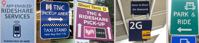
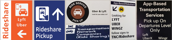
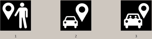
The number of icons in use at airports was widespread and there were numerous unique options that did not fit into a common theme. However, to the extent that there was a common theme, existing iconography for TNCs at airports centered on a similar concept: an outline of a phone or simply a car (see examples above). Though these icons are descriptive, there was no consistent usage, and many of these icons did not meet best practices or design standards for scalability.
Conceptualization & Design
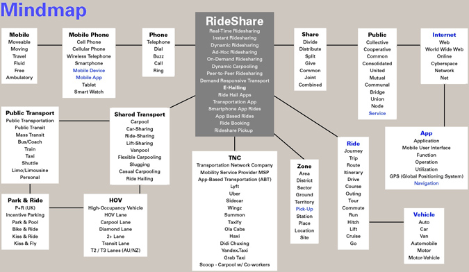
Ultimate Symbol defined the nomenclature criteria as: Descriptive, Simple, Neutral, Essential, and as Few Words as possible. They honed in on key words that would best clarify what the term should convey, with the focus on the destination (getting passengers to their pickup location) and the application they used, but not the actual device. Devices used to “hail” a TNC will vary, but all will use similar app-based technology. One part of the process was to evaluate existing terminology by doing a “mindmap” (below). Knowing what not to use is an important guide.
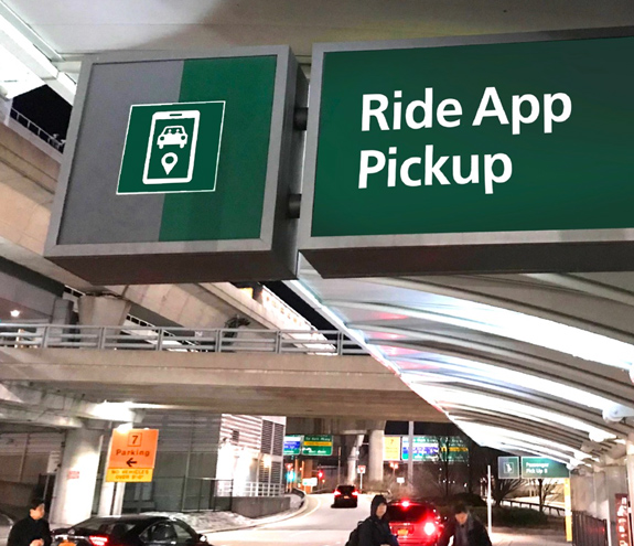
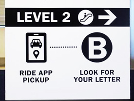
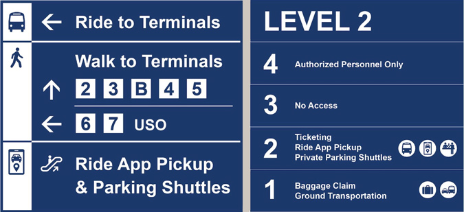
The term Ultimate Symbol created and recommended was “Ride App Pickup.” The logic is simple: the passenger is looking for a ride, using an app to summon the ride and needs direction to the pickup area. This term is unique and conveys quickly and clearly to the passenger what mode of transportation they are looking for. While drop-off locations may vary depending on terminals/airlines, the pickup point(s) will typically remain stationary and guidance for the passenger is needed, hence the addition of pickup as a further descriptor for the term.
Ultimate Symbol defined the icon design criteria as: Clarity/Content Viability, Simplicity, Scalability (large vs small), Longevity (cost/implementation), Fit within existing ‘Icon Family’ systems, Vetting by Wayfinding Profession, and Comprehension Testing.
Rather than settling on one particular icon, Ultimate Symbol recommended a set of similar concepts for testing. Even though current airport icons all used some variation of a phone icon, there was a concern with tying this icon to a contemporary piece of technology that will evolve over time. Therefore, the recommended central theme became that of a mapping pin. Used in online maps, TNC apps, and direction apps such as Waze, the mapping pin is a ubiquitous and common symbol used to help individuals navigate to a particular location. The group also wanted to examine whether the car was necessary for clarity, so symbols with and without were also tested.
Testing & Surveys
General population feedback was sought to further test these recommendations in the form of a survey. This survey was intended as a tool to gather additional data to help choose the standard in conjunction with the consensus of the working group and airports. The recommendations were tested against some common existing terms and icons being used in airports. Though the working group felt certain terms (“Rideshare”, for example) were not best suited for use, there needed to be a baseline set for the proposed new term and icon. Survey results were used to draw conclusions on the direction of the final term and icon. Airports within the working group were presented the results of the survey and a final preliminary recommendation for term and icon, with LeighFisher presenting the view of the general population from the survey results and Ultimate Symbol that of the design community. The preliminary and final recommendation for term was that of “Ride App Pickup.” It performed very strongly in the passenger survey and within the design community. It is a unique term that will not be confused with other modes of transportation and is encompassing enough to include future modes that use an app-based service.
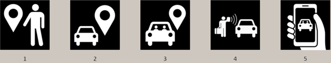
It was the recommendation of LeighFisher and airports that the choices tested include icons similar to those currently in use at airports. Therefore, the group list of surveyed icons was expanded to included icons 4 and 5 (see below) along with Ultimate Symbol’s original recommendations.
Survey Results
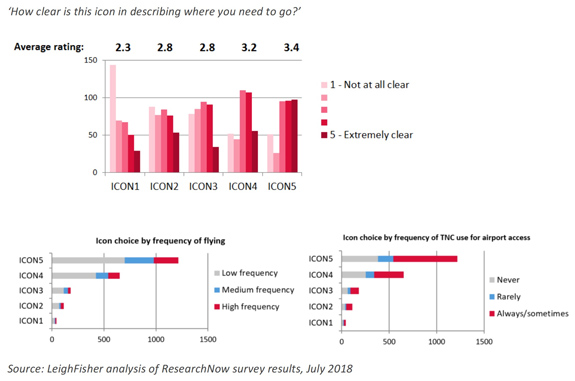
The two-week survey window yielded more than 2,000 qualified responses, with a strong sampling of different ages, races, genders, incomes, and levels of flight frequencies and TNC use. The raw data was then analyzed and presented to airports by LeighFisher.
Preliminary & Final Recommendation to Airports
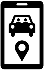
The preliminary recommendation for the icon was Icon 5, which included a phone, a car and a hand. In this case the survey did provide a clear result. However, the airports and working group concluded that additional icons including some combination of a phone, a car, and possibly a hand (shown above) should be evaluated for further consideration before reaching a final recommendation. Ultimate Symbol utilized this feedback and created three revised icon choices (shown below) by applying the parts of the tested icon that best resonated, also applying best practices and design standards. Note that the typical depiction of a “home button” is not present, as most mobile devices are trending away from it. Despite adding complexity to the icon, the two figures in the auto were inserted at the behest of airports to emphasize the ride-sharing aspect and to further differentiate it from the existing “parking” icon.
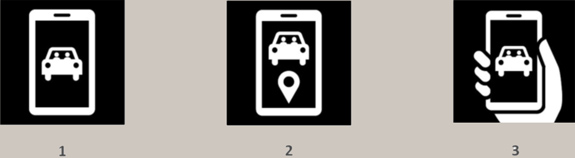
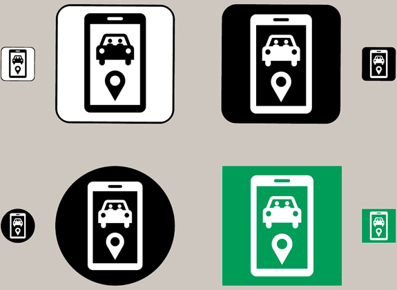
Icon 1 is clear and concise, but does not fully convey the message of the chosen term: “Ride App Pickup.” However, the group felt that the addition of the mapping pin in Icon 2 helped clearly establish an icon that properly fit with the term: “Ride App Pickup.” It also helps differentiate the icon from other similar icons in use such as parking, taxi, car rentals, limos, etc, and increases clarity of the message: app/location. The mapping pin was put under the vehicle because it might otherwise appear to be a conversational “thought bubble.” With Icon 3, the hand reduces scalability/visibility and it is not considered necessary to comprehend the message. It could also present challenges in the future as technology evolves away from handheld devices. Therefore, the final recommendation of the working group is was Icon 2, shown below in various iterations. Finally. a best practices standards manual was developed by Ultimate Symbol and can be found along with EPS art for the icon in the final report.
Project Outcome & Recap
After an exhaustive six-month process that included multiple internal group working sessions amongst airport partners, TNCs, the design community, and industry experts such as LeighFisher, the working group recommendation was the following term and icon. The original goal of this project was to develop a passenger-facing common term and icon that directs TNC customers and driver/operators in airports to the proper pickup location(s). The final term and icon meets the project’s objectives and is an effective addition to existing airport signage standards. As adoption by airports increases across the country (as well as by the TNCs), this standard benefits both the create a seamless passenger experience and improve the efficiency of TNC operations at airports. Los Angeles International Airport (LAX) was the first airport to deploy the new standard, updating its signage as of September 2018 (see below).

The complete final report, “Establishing a Common Standard for TNC Wayfinding at Airports, August 2018,” is available for download HERE >