
Posted by Mies Hora (updated from a December 19, 2014 post)
I’m a firm believer in the development of new and more powerful ways to visually communicate important messages non-verbally. As a wayfinding professional and symbol designer with a keen interest in all things non-verbal, I say “by all means, let’s move communicating the accessibility concept forward.” But caution is appropriate when attempting to replace a well-established and vitally important societal icon with something that has not been fully usability tested, approved by relevant public regulators, or that has survived the rigors of a comprehensive design process. A significant, but troubling attempt was made more than five years ago to replace the ISA (International Symbol of Access), and it’s selective implementation continues to roil the sign industry, wayfinding designers, and regulatory agencies.
New York State Takes the Plunge
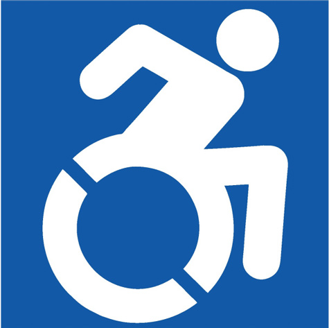
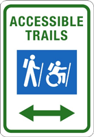
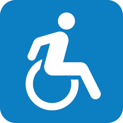
On July 25, 2014, New York Governor Andrew M. Cuomo signed legislation (A.8193/S.6846) that amended existing law to require the removal of the word “handicapped” from new or replaced state signage, as well as update and destigmatize the accessibility logo. The state changed the terminology on such signs, employing the word “accessible” instead of “handicapped.” The newly revamped logo design (below), known as the “Accessible Icon,” depicts an ‘in-motion’ visual of a person using a wheelchair.
Inconsistency is the Hobgoblin of Wayfinding Systems
Developed in 2010 by artist and design researcher Sara Hendren, philosophy professor Brian Glenney, and designer Tim Ferguson-Saunder, the AIP (Accessible Icon Project) started out as a grassroots effort in Boston with supporters placing stickers featuring the updated graphic over signs with the old wheelchair symbol. They wanted to draw attention to the symbol as a way to address issues around inclusivity, aiming to “portray individuals with physical disabilities in a new light.”
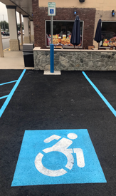
To date it has been adopted by a number of organizations and municipalities in the U.S., including the NFL’s Jacksonville Jaguars, the city of Merriam, Kansas, and New York City, among other localities, businesses and schools. Abroad, disability organizations such as the Enabling Unit in India are promoting this version. Indeed, the AIP symbol has popped up on parking lots throughout New York State, usually stenciled onto the pavement. Federal Highway Department has chosen not to approve the symbol, thus above the pavement, one will often see the old, original ISA on a signpost, as it has appeared since 1968 (see photos below).
The Long Road to Officialdom
If the founders of the Accessible Icon Project were interested in making their symbol official, it would need to be reviewed by the U.S. Access Board, a government agency that makes recommendations regarding ADA regulations, mostly recently in 1991 and 2004. (Agency spokesperson Dave Yanchulis says there are no immediate plans for another review.) The Department of Justice and Department of Transportation then review those recommendations and determine how they’ll be applied. The process isn’t exactly speedy. The 2004 regulations didn’t go into effect until 2012, starting with an 18-month window when businesses and government offices were able to apply either standard. If the icon were to change, facilities wouldn’t be required to replace their signage immediately, but would only be expected to use the new standard as new signs were added or replaced. (When the ADA was passed in 1990, the federal government adopted the ISO designation for the symbol, but if that group were to adopt a new icon, the federal government would be under no obligation to follow suit.)1
Serious Qualms
In late 2014, one of my transportation clients (the MTA) worriedly asked me to look into this new symbol further, because altering or changing a ubiquitous accessibility symbol sign in use is not an insignificant prospect for any large public institution. As part of a comprehensive assessment of the vast New York system, I had already recommended in 2009 that the MTA utilize the Whitehouse Meeker variant (below, second from left), which was accepted and has gradually been implemented. As part of the process of researching the new AIP accessibility symbol being mandated by Albany, I therefore set out to study it’s viability by looking at the response to it by wayfinding design and standards professionals, governmental agencies, and ADA specialists, as well as the disability community itself.
I was immediately struck by the realization that few, if any, comments were in evidence by any reputable or established wayfinding or symbol design specialists in favor of, or against the new design on all of the web sites, news articles, or announcements researched, including those of NY State.

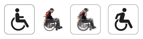
L to R: Original ISA (International Symbol of Access (1968), ADA-compliant (Whitehouse/Meeker, early 80’s), tipsy ‘In-motion’ version (Brendan Murphy, 1986), ‘jumping over a barrel’ in-motion variant (with foot), AIP (2012).
A Decisive Stumble
As a wayfinding professional, my initial impression of the newly proposed AIP symbol was at first incredulity, followed by unmitigated exasperation. While there is universal agreement among those in my field that there’s room for improvement in the original International Symbol of Access (ISA) symbol dating from 1968, there are also alternatives available and in use already. Upon further reflection, it appears that the extreme approach taken by the AIP has erred in a number of important respects (see my detailed brief). The most important aspect being that the idea conveyed by the AIP is all about speed and even racing. The subject is literally bursting out of its box, head over heels, arms and legs aflutter. As they say in the Boy Scouts, “Safety first!” What’s the hurry? – municipal traffic ‘calming’ is currently de rigeur. The AIP symbol might be a contender to represent a Paralympics wheelchair race event… but not for a crowded subway platform or elevator (not to mention that the 45-degree angle stencil line is reminiscent of the standard prohibition slash).
Indeed, the American National Standards Institute (ANSI) A117 committee disapproved a proposal to use the new symbol in lieu of the ISA (International Symbol of Access) specified in the ADA Standards. The proposal was defeated because the committee was convinced that consistency among symbols is important, particularly for people with low vision or cognitive disabilities. And in May 2015, the Department of Transportation again declined to adopt the symbol, noting that it was not “unmistakably similar” to the original. Therein lies the rub.
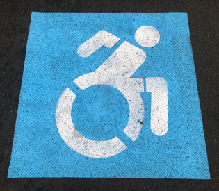
Insult to injury – the AIP suffers further indignities by having it’s arm and leg separated with stencil cut lines (or is that an armband and shorts?). The U.S. Department of Transportation does not officially recognize or promote the AIP, thus inconsistency reigns throughout the Empire State.
Boon or Boondoggle?
While the noble effort to modify the symbol for access to the new ‘in-motion symbol’ can be understood from the viewpoint of wanting to “de-stigmatize the access logo and to correct society’s understanding of accessibility” – as stated by Governor Cuomo – this particular path toward those goals has proven, in my considered opinion, to be a decisive stumble. The advocates of the new ‘Accessible Icon’ design have inadvertently chosen a visually flawed vehicle to make their point, and risk alienating and confusing the very audience whose lives it was ostensibly designed to enhance, not to mention the general public.
After discussing the issue with a broad array of wayfinding and design colleagues, and researching the topic extensively, I and my design team came to the conclusion that the 2012 AIP symbol is the result of misguided enthusiasm and over-reach. Simply put, the AIP is not a well-balanced and consistent member of the international symbol ‘family.’ To make matters worse, AIP members are breaking cardinal rules of public information symbol design, such as advocating multiple, adulterated applications of the AIP, further weakening it’s chances of official acceptance. “We are continuing to do fun things with the Accessible Icon, and the best part is seeing others take our symbol in new directions.”2
Above, unofficial sign sample applications purportedly enhancing usage the AIP. Source: Brian Glenney
There’s Something Happening Here, What It Is Ain’t Exactly Clear
So how did the AIP get this far? Why weren’t nationally recognized information design professionals consulted: venerable and well-established organizations such as the American Institute of Graphic Arts (AIGA) or Society of Experiential Graphic Design (SEGD)? It’s a loaded subject, but let’s just say that there are too few protocols or funds in place currently for the vetting or testing of critically important public information icons as needs arise and change, as is done rigorously in China. The network and conduits for oversight of such matters in the United States government have substantially atrophied, become vestigial, or slowed to a crawl, resulting in New York State’s fateful decision to throw caution to the wind and proceed with the AIP.
However, that’s not to say that a more nuanced solution couldn’t be developed that meets the desired criteria of a more ‘active’ disabled constituency. AIP founders Hendren, Glenney, and Saunder admit that the symbol is an evolutionary step in a long process and insist that universal adoption was never the goal. “Our response has always been, ‘You’re right — this isn’t the best version of the icon.’” Their “greatest hope is that this causes a conversation and positive change in people’s actions and attitudes towards others.”1
Taking Up the Challenge
Ultimate Symbol decided to join the conversation, rethink the issues, and develop a more viable solution. To summarize, our the goal is the creation of a ‘proactive’ accessibility symbol that stays within essential and well-established legal guidelines for comprehension and efficacy, particularly within the transportation context. It is imperative that wayfinding designers fully acknowledge and understand the humane desire of the accessible community to be represented appropriately (not ‘lifeless,’ ‘helpless,’ and/or ‘inert’), entities like the great state of New York’s sincere political quest to honor their interests, and for regulatory agencies to meet current oversight requirements mandated by multiple committees and governmental bodies. Finding a visual ‘sweet spot’ that meets these varied criteria is certainly challenging.
After carefully reviewing the legacy of attempts over the past five decades, my design team and I decided to look for ‘common ground,’ and to propose a solution founded in established official practice, yet sensitive to how today’s culture informs. Starting with the generally accepted and ADA-compliant Whitehouse/Meeker variant, designed for the Army Corps of Engineers in the early 80’s (below left), we looked at the mechanics of wheelchair use (below middle) to see if that might influence the design, rather than staying completely conceptual in approach.
The result (above right and below, center), fulfills many criteria and may be able to meet ADA requirements including being “unmistakably similar” to the original ISA. The process now proceeds to gathering input from the design community at large, before presenting it elsewhere and to the buzzsaw of public opinion. The time has come to move beyond the discord, confusion, and inconsistency thrust upon us by the incompletely conceived AIP symbol (below right, in a positive contrast symbol comparison).
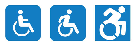
While perhaps not perfection, the update to the International Symbol of Access proposed by Ultimate Symbol (above middle and below) is a reasonable, balanced solution, that meets international design standards, and just may move the subject forward in a constructive manner while meeting the demands of the accessibility community. The wheelchair user is lively and in motion… just not creating a commotion. Reactions so far are generally positive… what do you think? We invite your comments and thoughts.
1. Can we design a truly inclusive accessibility icon? Article by Scott Kirkwood
2. www.brianglenney.com